Connecting the bootstrap grid to the ColorMag theme
For many, creating grids for a website is a pressing issue. The main problem is that grid elements must be adapted to different screen sizes, it is desirable that the programmer himself can specify at what extensions how the elements should line up. In html, FlexBox is used for this, which is terribly inconvenient due to its limitations and the need to write additional rules for each screen size.
The way out of the situation is to use the bootstrap grid system, but the main problem is that if you connect the bootstrap styles to WordPress, the layout breaks.
What is a bootstrap grid? Here is how the vendor describes it: Use our powerful mobile-first flexbox grid to build layouts of all shapes and sizes thanks to a twelve column system, six default responsive tiers, Sass variables and mixins, and dozens of predefined classes.
Why is it needed at all? Let’s say you want to make the main page according to your design, but the theme’s features do not allow you to do this. Then bootstrap grid will help you. You can create the blocks you need and style them however you want. An example of usage will be shown on the main page of this site.
That is, this is a set of css for building blocks.
Today I will show you how I use the bootstrap grid on wordpress with no issues for the template.
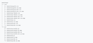
Bootstrap has a set of css files. We only need 1 file.
Unfortunately, the bootstrap grid file itself is not available for separate download. Therefore, we download the entire archive. Open it and you will see bootstrap-5.3.0-dist folder. Open this folder, open the css folder in it and find the bootstrap-grid.css file in it. We extract this file to the desktop of your computer or to any other folder.
Now you need to open your hosting. Open the files folder and upload the bootstrap-grid.css file.
Now open the footer and at the very end of the file, before the closing </body>, write the path to your file as a link on a new line and edit the path to the file:
<link rel="stylesheet" href="https://yourdomain/bootstrap-grid.css">
Now open the link to the file in your browser
https://yourdomain/bootstrap-grid.css
and if you see the css code, then you did everything right.
That’s all. Now you can use the bootstrap grid to create layouts of all shapes and sizes. Here is an example. Create a row and place 4 blocks in this row.
<div class="container">

<div class="row">

<div class="col-12 col-md-6 col-lg-3"><a>Basics</a></div>

<div class="col-12 col-md-6 col-lg-3"><a>Tasks</a></div>

<div class="col-12 col-md-6 col-lg-3"><a>Examples</a></div>

<div class="col-12 col-md-6 col-lg-3"><a>Conclusion</a></div>

</div>

</div>
Example site: https://abiturients.kz/speczialnosti/

